I've seen a few different people complaining about the similarity between Disney heroines, and while I don't want to join in on that debate, I feel now's a great time to talk about why so many protagonists in animated movies have baby faces or child-like features.
As for why the girls in Frozen look so similar to Rapunzel, the reason seems so obvious that I'm surprised I even have to point it out:
Baby-Face Bias. The word bias in there makes it sound like a bad thing, but this principle is awesome because it allows designers to use the natural conclusions people make when seeing a character for the first time, and helps us to predict the lens through which the audience will view that character's actions as they develop. It's not entirely clear how much of baby-face bias is innate and how much is learned, but it appears to be true across cultures.
To understand this, you have to first understand that most character designs are not meant to be a reflection of real life. They are symbols of real things, exaggerated to create the illusion of life. There are lots of reasons for using symbols in design, including the uncanny valley, but I won't talk about that now.
 |
| This is an eye. |
 |
| This is not an eye. It's just a symbol that we understand to mean "eye." |
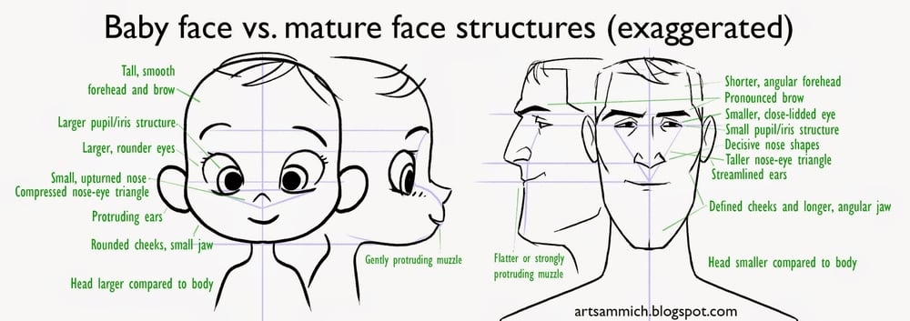
To understand what baby-face bias tells us about the character, let's compare against the biases that come with a mature face.
These proportions and shapes tell us that this character is able, experienced, and established. You might rely on these shapes and proportional relationships to design a character that is capable and cunning. In fact, use them all at once and your character might be seen as too "streetwise" to be trustworthy.
In contrast, a baby-face says the character is naive, helpless, and forthright. We naturally see that character as having a not-completely-formed identity, or as having a destiny that is not yet defined.
So why are baby-faced features so popular in animated protagonists? Well, the large eyes and big head definitely help make the character readable from multiple distances, but I don't think that's the fundamental reason why.
Most children's movies are about characters who are searching for their destiny or identity, or who are earnest-hearted characters facing a difficult or indifferent world. The characters then are designed to fit the stories, and the similarity in the stories naturally result in similarities in the characters.
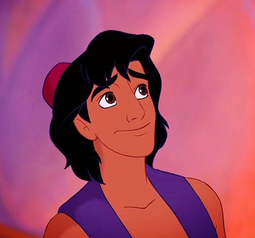
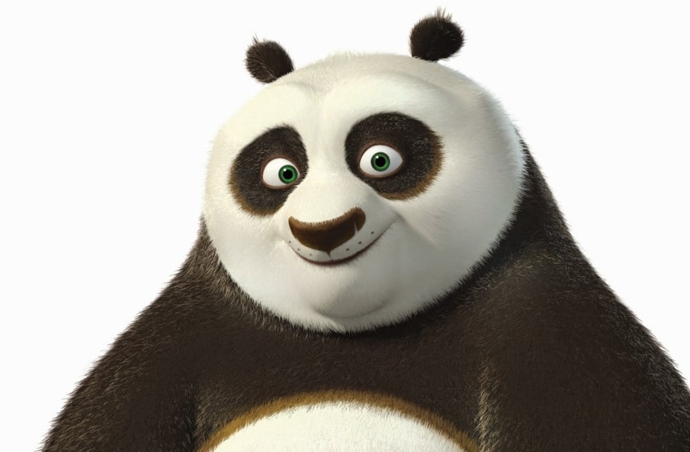
That said, very few characters actually go full baby-face; most mix elements together to achieve a character that combines the right elements of experience, capability, innocence, and development. I picked mostly male examples because I wanted to show that baby-face isn't just used on female characters, although I do think most animated films tend to lean more heavily on baby-faced features for women (not just Disney).
 |
| Aladdin's mostly adult shaped face---but with somewhat rounded chin, larger head and baby eyes---supports a character that can be capable and crafty, but also naive and honest-at-heart. |
 |
| Po=chubby baby. Except the larger brow and broad nose with the arced muzzle, give him the potential for some really aggressive moments. |
 |
| Even the ridiculously baby-faced Elsa is using certain elements to add maturity and a bit of gravity: stronger brow, longer nose, defined chin, half-squinted eyes. |
I'm not expecting this post will settle any debates, but hopefully will give some insight into some of the thinking behind baby-face in protagonist design. I'd love to hear what you think too!


