Class demo

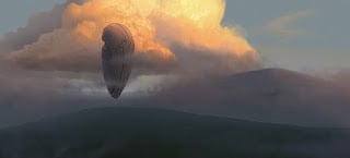
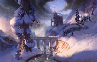
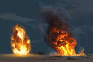
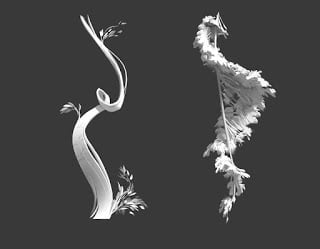
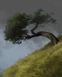
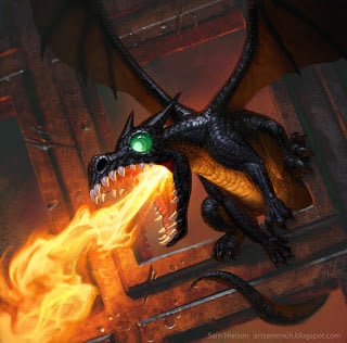
Something I painted for the "sculpting with light" demo in my digital painting class at BYU. The class is for animation students so the stuff I teach is focused on painting for visual development and other animation work.


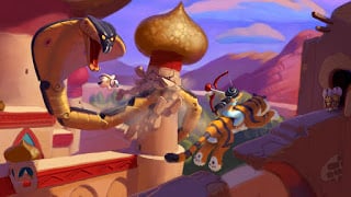
Early Infinity Pitch

An image I did during very early explorations for Disney Infinity. At this point, the hope was that we'd have all sorts of types of toy in it, much like the Toy Story 3 Toybox mode. Some semblance of this idea survived, but for the main characters, John Lasseter really wanted to have a single style and toy type to unify everything. That was the right call for sure, but this would have been fun.

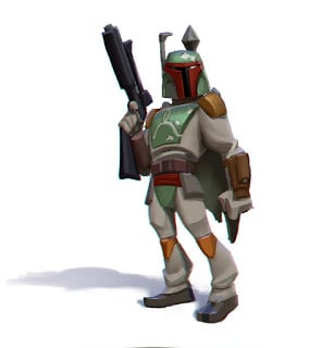
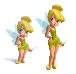
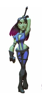
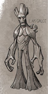
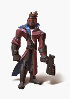
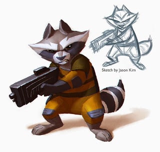
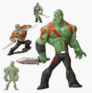
Some character designs I did for Disney Infinity 3.0

I did a bunch of work early on Disney Infinity 3.0, which is coming out in a week. Here are a few of the concepts that I did that I've seen on other sites.
Worked on Boba Fett. Career achievement unlocked!

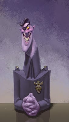
Fear was such a fun character to draw. It was tricky figuring out how to pull off the feel of skinny appendages in a way that could be molded into strong plastic, though.

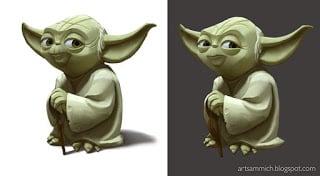
A take on Yoda that didn't make it in, but might have influenced the final look. It's hard to tell sometimes.

"How do you find time for personal art?"

I was asked this question by another professor during the interview for my job at BYU. Now that I've been at BYU for almost a year, I understand that his question wasn't a test for the job, but an honest question about how to fit one more thing into an always-full schedule. The thing about being a professor is that you never clock in or out---your teaching and prep time, personal time, and freelance time all blend together and you're left to make your own calls about how to balance it all. I think I actually stammered my answer, something like "Well, uh, I just do it." That was a useless answer and I wish I could have a do-over.

I get summers off at BYU, which sounds awesome and laid-back, but in reality I'm spending that time working on freelance character design, illustration, preparation for my classes, and various tasks around the house. I get to set my own schedule, but it's always full no matter what order I put things into. What I thought would be a great break where I could do a lot of my own work has been just as busy as the semesters when I'm teaching.

So I've been thinking a lot about an answer Marcelo Vignali gave in a great interview with Bobby Chiu a while back. Answering a question about how he finds time for figure drawing, he said he makes figure drawing non-negotiable. In other words, he schedules time for it, and when that time comes, no other task takes priority, no matter how urgent (of course this doesn't apply to the house burning down scenario. Or maybe it does: guess I don't know Marcelo well enough to say for sure).

I've taken that "non-negotiable" mindset with my personal art these last few months, and I'm so glad I did. I have a block of time scheduled for it every morning---not much, just an hour---but it's enough for me to chip away at stuff that comes out of my own head. I can't say I've gotten to the point where it's non-negotiable yet; there have been days when I've skipped it for a big deadline, but I'm getting pretty consistent. And amazingly, even slowly chipping away at it is deeply satisfying, and I find more energy for the jobs I have to do afterward. For me personally, it works best to not overthink what I use that time to paint on---sometimes an idea works out and sometimes it doesn't. That's not the part that matters.
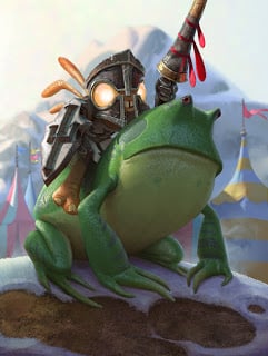
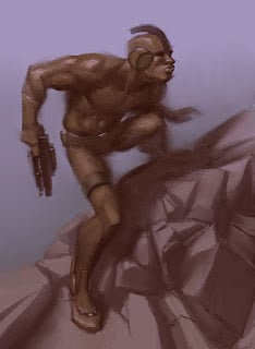
One of the paintings I've been slowly chipping away at. Not because it's worth painting, but because it's good for me to sometimes paint stuff just for fun.
The reason for this post is that I know lots of artists personally who struggle to find time to draw or paint their own stuff. I know many skilled artists who haven't done a piece of their own for months or even years. Most are people in the industry who by all appearance have completely full schedules. And yet as I've scheduled in that time, I haven't noticed a deficit anywhere else. I'm somehow getting everything else done just fine. Maybe there was some slush time in my schedule that I didn't realize was there, or maybe that extra energy is making up for the lost time. Either way, if you're the person asking the question in the title, I recommend trying this. Doing your own art may not be urgent, but it is important, and if you treat it as if it is urgent, you'll be better off.

And while you're at it, go read this article.

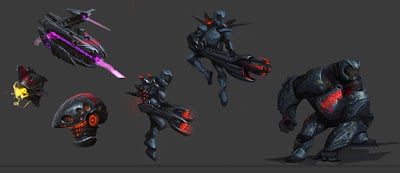
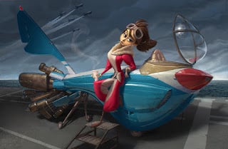
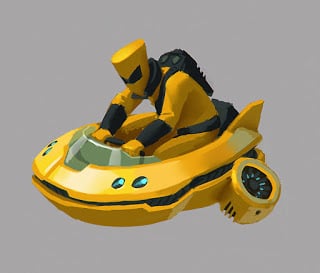
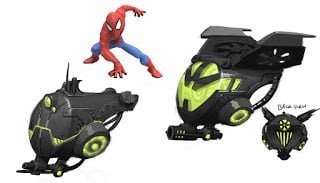
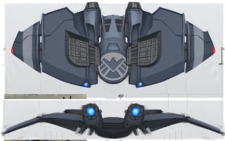
Some Gadgets from Disney Infinity

I was asked to design a robotic flying turret for AIM, but I figured there was no reason why it couldn't have a pilot. 
A car-sized flying turret for Green Goblin? Sure, here you go.
I don't know if this made it into the game, it was supposed to be a Shield-issued version of the Green Goblin's glider 
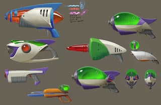
Some weapon designs from the Toy Story in Space playset, only a couple of these made the cut.

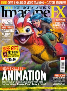
Cover and tutorial for ImagineFX

 Finished this one recently. They pushed the saturation of the cover image into crazy land for some reason though, but I guess it turned out alright anyway. The full page image on the article is more what I imagined it should look like.

Symbols and Motifs Cheat Sheet

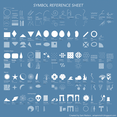
I've been wanting to make something like this to use in my design classes for a long time now: a quick reference guide for visual symbols. If contrast is the key to visual communication, symbols are the vehicle we use to create contrasts and making those contrasts meaningful, like words that make up a sentence, or sentences that make up a story. Having useful symbols at your fingertips is essential if you want to create designs that have a high propositional density (the link talks about graphic design only; maybe another post on how this applies to visual development later!).

This is not meant to be comprehensive: it doesn't include every meaningful line, or every version of a symbol, or every possible interpretation or meaning of the shapes. These meanings are only the ones I've run into most often (so far), and this chart doesn't include ancient meanings unless those meanings can be found or inferred naturally by a lay person.

That said, I'd love to hear your feedback. If you see errors, have suggestions for symbols that are missing, or think of meanings I should include, post them in the comments either here or on Facebook. I'm considering it an open document and I'll revise as many times as necessary until it's as useful a resource as possible!
Quick note on the negative context/positive context thing. These aren't just positive vs. negative associations: White text are meanings that will arise naturally in a neutral or positive context, while black text descriptions will only arise in cases where the context skews the way you're viewing that shape. For example:
In both examples, the triangles add an element of sharpness and danger to the designs (so sharpness and danger are white in the chart), but the context changes the way we perceive the oval in each. In the left, it softens the character and adds a sense of friendliness in contrast with the sharpness of the triangles. But in the negative context, the sphere appears extra weak and vulnerable. Let me know if that makes sense!
Large version here.

A Jumble of Jasmines

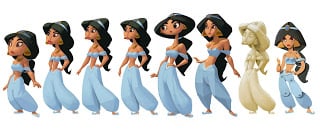
I didn't contribute much to the final Disney Infinity figure of Jasmine, but early on when we were figuring out the Disney Infinity style, I used Jasmine (among other characters) as a base to test out different styles.
This set was done during the dark days of our search---nothing we'd done was gaining traction and the art director keep asking for "something weird or edgy." That is why these are so messed-up looking.

"What kind of brushes did you use for this?" (My CS6 brushes)

As much as it is mocked by people, this is actually not a bad question! Although it can be difficult to answer, because it's not what the brush is that makes it great, it's what you use it for. That said, the tool you're using is still a critical part of what you accomplish: saying good painting is not about the brushes is like telling the mechanic that fixing the car isn't about the wrenches. I definitely learned this when I switched from Painter to Photoshop a couple years ago: I felt suddenly inept as a painter using all these clunky, awful brushes. This is when my long search for great brushes began.

The last time I posted some of my brushes, they were all in CS4. I've had various requests for my CS6 brushes, but I've hesitated to post them because my toolset was getting so large and unwieldy. I've found a way to organize them now that will hopefully make sense. Some of these are my favorites out of these collections, or from Chris Wahl's sets. His spatter and inking brushes are especially great, so if you like the ones I picked, I'd recommend you check out his full sets. The rest of the brushes are either heavily customized or created by myself.

I've been using and modifying a lot of brushes from the Kyle Webster Megapack lately also, which is absolutely worth the money, especially if you do a lot of inking.


So my new idea for organizing brushes is to put different categories of brush into separate toolsets, separated according to the type of work that needs to be done. Then if you use "Load Tool Presets," you can append however many preset groups you need. If a set gets too large then I have the option to break it into even more specific categories. This makes finding the brush I want while I'm painting faster and easier.

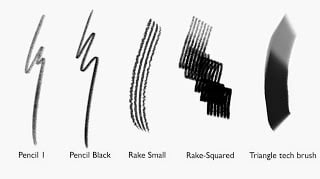
Here are my current categories. The title of each has the link to the brush download. You load these up from the Toolset menu, not from the brushes menu!

The Base Set
This brush set is mostly drawing brushes, but it includes some other tools I use all the time, like the rounded eraser and the Smudge Nice tool I created. The idea is to keep this set loaded and append the others to it. You'll notice that I use the tilt function a lot in my brushes---you'll need a Intros 4 or higher model to see what these brushes are really meant to do.


The Painting Set
I add this set in when I'm past the sketching phase and ready for painting. The occlusion brushes are a quick and dirty way to paint ambient occlusion around edges of objects. Again, you'll need the tilt function to use it.


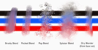
Blenders
I have my two most used blending tools as part of the base set, but there are a bunch of other effects it's nice to have handy. This might be another set I load in when I start painting.


Spatter/Texture and Organic/effect brushes.

I put both of these in the "other" category; they're both specialized for when I need leaves, ground cover, or other textural effects. I imagine as the set grows that I'll separate character elements (fur) from environment elements (clouds and trees), but right now there aren't too many to keep track of. The way I see it, if you like this system of organization, you could add your own tool sets of tech elements, particle effects, or whatever you like, without bogging down your UI or workflow with too many things all at once. Take what you want, delete what you don't, and have fun!

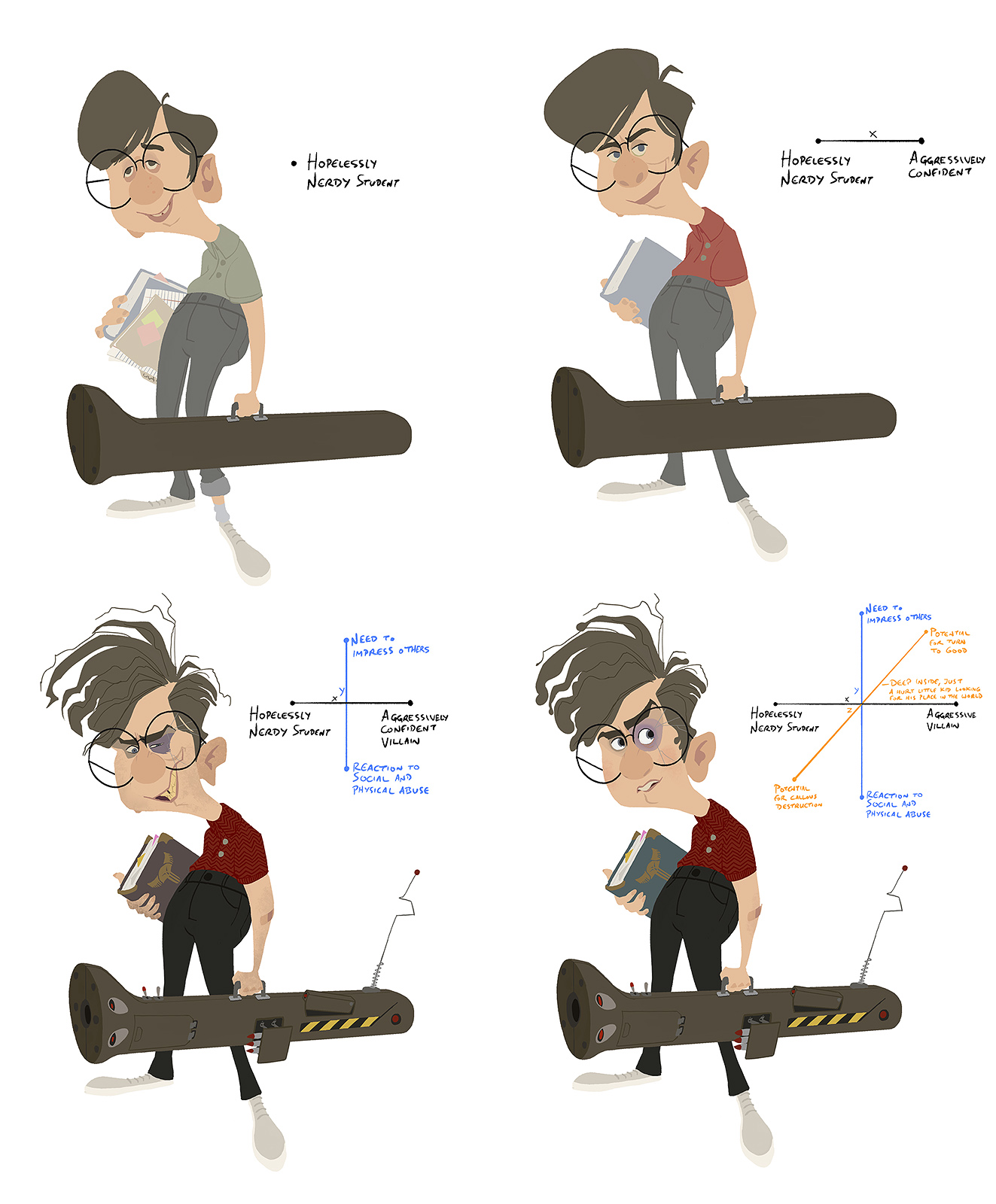
Disney Infinity 3.0

I did some work on Disney Infinity 3.0 before I left Avalanche to work at BYU, so I'm feeling pretty proud/happy seeing the stuff coming out about it. Here's a great video showing the toy design process, and introducing you to some of the Avalanche concept and modeling team (I miss you guys!) and there's a bit of art I did in there as well.