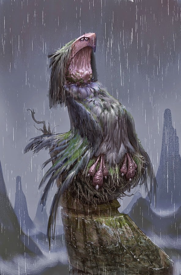
Andrea Femerstrand (who you really should be following because she's amazing) asked what was different between my final version of this and where I ended up at the end of the class demonstration.
I think the earlier version more clearly communicates the feeling I wanted with the lighting, but that required the lighting to feel a little bland and static (perfect as a narrative beat but not as great for a stand-alone image). So I punched some of the contrast and added some soft rim lighting. I tried to look at the image from a distance and up close since once the image is posted I couldn't control the scale people see it at. I also changed some of the colors because I didn't like the color relationships in the original image. Anyway, I hope that is helpful to see.

