I had fun with this project and I'd like to share a little bit of the process that went into the visual development of it. I won't do this with all of the concept art we did for the project, but maybe for a couple of my favorite designs.
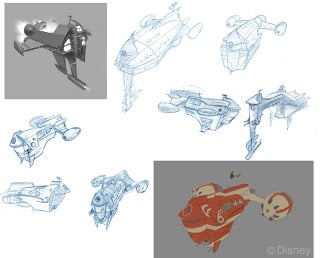
The Battle Barn was one of the hardest designs to get right. The below picture represents only a fraction of the total number of drawings and attempts we made (all of the below drawings were done by me, but lots of artists provided multiple takes that influenced the final design). In fact, I only included the drawings that acted as "steps" toward the final design---we took a lot more directions than this before settling on this design. It was really hard to design something that effectively mixed the idea of a starship with a barn, all the while giving the same flavor as the ships that the Disney artists designed for the movie.
As you can see, there were a lot of sci-fi influences pulling this thing in different directions. However, in the end (and with the help of Todd Harris) we realized that what was missing was the fun, Star-Trek-spoof feel, and that we were maybe straying too far from the "barn-iness" we needed. So I worked a bit with the proportions and the grain silo section, and viola!

(By the way, I am NOT a technically-trained industrial designer or anything, so that's why these drawings have bad form and perspective)
Here's the final concept:

The Battle Barn was one of the hardest designs to get right. The below picture represents only a fraction of the total number of drawings and attempts we made (all of the below drawings were done by me, but lots of artists provided multiple takes that influenced the final design). In fact, I only included the drawings that acted as "steps" toward the final design---we took a lot more directions than this before settling on this design. It was really hard to design something that effectively mixed the idea of a starship with a barn, all the while giving the same flavor as the ships that the Disney artists designed for the movie.
As you can see, there were a lot of sci-fi influences pulling this thing in different directions. However, in the end (and with the help of Todd Harris) we realized that what was missing was the fun, Star-Trek-spoof feel, and that we were maybe straying too far from the "barn-iness" we needed. So I worked a bit with the proportions and the grain silo section, and viola!

(By the way, I am NOT a technically-trained industrial designer or anything, so that's why these drawings have bad form and perspective)
Here's the final concept:
