 |
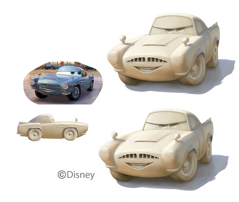
| When I first drew the middle one I thought the lips were okay, but now that I see it I wonder what I was thinking. |
Disney Infinity Avengers
With Avengers: Age of Ultron coming out this week, it's a good time to pull out some Infinity stuff from the Avengers playset.
 |
| A bunch of Cap designs from early Infinity through Infinity 2. |
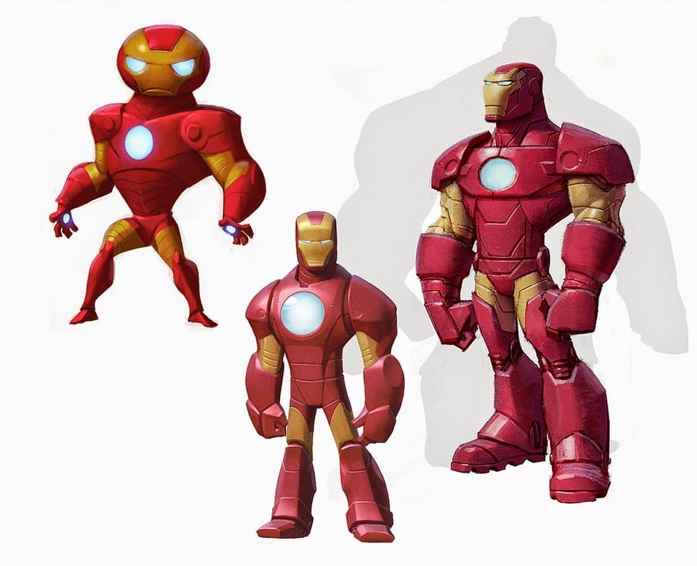 |
| The middle and right paintings are based on sketches by Jon Diesta |
 |
| The upper Iron Man in the previous image is from an early Infinity style take I tried. I still really like the strangeness of this lineup. |
Twilight Whelp
Disney Infinity Frost Giants
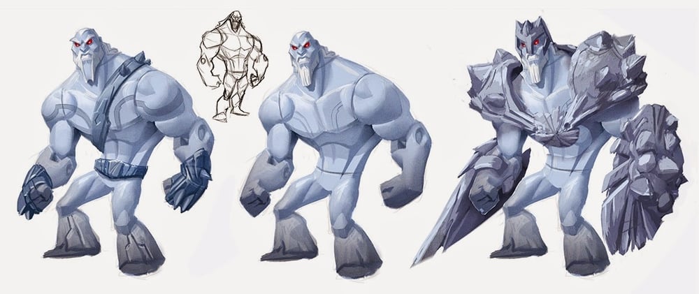
I got to work on the frost giant designs for the Avengers playset.
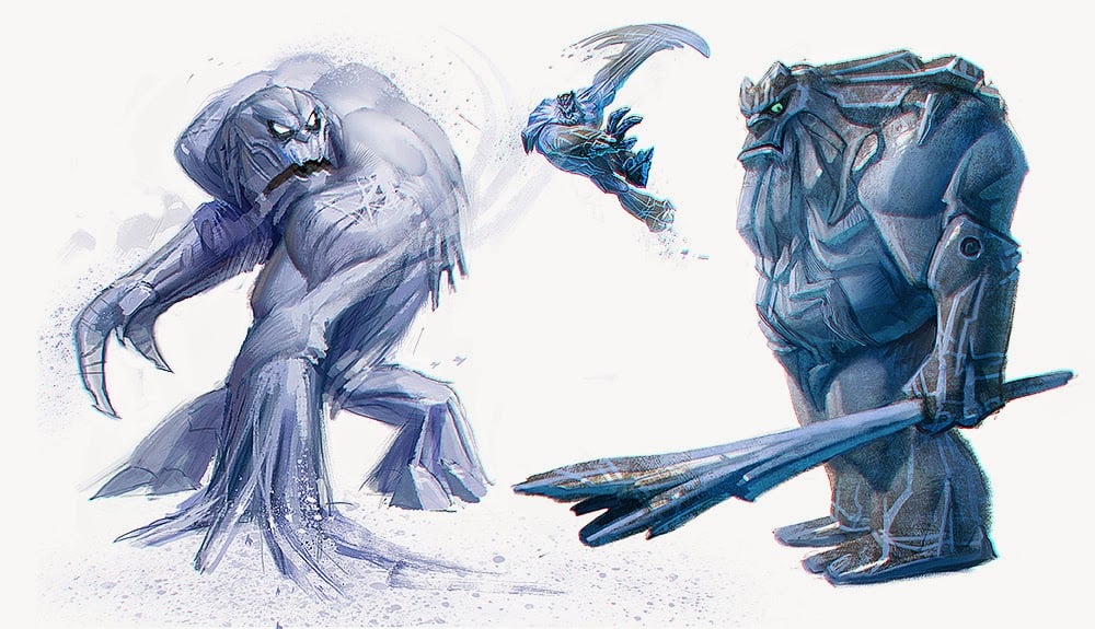 |
| The early versions were more beast than man for rating reasons. |
 |
| At this point I was abandoning the toy-ishness altogether just to find the look. I knew at some point we'd have to reintroduce toy elements. |
 |
| A painted variant on an awesome design by Brandon Dayton |
 |
| A paint over of a great Ben Simonsen design |
 |
| The game designers wanted a powered-up version where the armor's spikes grew. I think they abandoned that idea pretty quickly after they saw this painting. |
 |
| Another variant on a great Brandon Dayton design. This one was supposed to use the Hulk Rig (abandoned concept) |
Baby-Face Bias
I've seen a few different people complaining about the similarity between Disney heroines, and while I don't want to join in on that debate, I feel now's a great time to talk about why so many protagonists in animated movies have baby faces or child-like features.
As for why the girls in Frozen look so similar to Rapunzel, the reason seems so obvious that I'm surprised I even have to point it out:
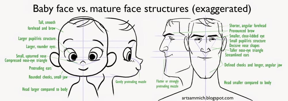
Baby-Face Bias. The word bias in there makes it sound like a bad thing, but this principle is awesome because it allows designers to use the natural conclusions people make when seeing a character for the first time, and helps us to predict the lens through which the audience will view that character's actions as they develop. It's not entirely clear how much of baby-face bias is innate and how much is learned, but it appears to be true across cultures.
To understand this, you have to first understand that most character designs are not meant to be a reflection of real life. They are symbols of real things, exaggerated to create the illusion of life. There are lots of reasons for using symbols in design, including the uncanny valley, but I won't talk about that now.
 |
| This is an eye. |
 |
| This is not an eye. It's just a symbol that we understand to mean "eye." |
To understand what baby-face bias tells us about the character, let's compare against the biases that come with a mature face.
These proportions and shapes tell us that this character is able, experienced, and established. You might rely on these shapes and proportional relationships to design a character that is capable and cunning. In fact, use them all at once and your character might be seen as too "streetwise" to be trustworthy.
In contrast, a baby-face says the character is naive, helpless, and forthright. We naturally see that character as having a not-completely-formed identity, or as having a destiny that is not yet defined.
So why are baby-faced features so popular in animated protagonists? Well, the large eyes and big head definitely help make the character readable from multiple distances, but I don't think that's the fundamental reason why.
Most children's movies are about characters who are searching for their destiny or identity, or who are earnest-hearted characters facing a difficult or indifferent world. The characters then are designed to fit the stories, and the similarity in the stories naturally result in similarities in the characters.
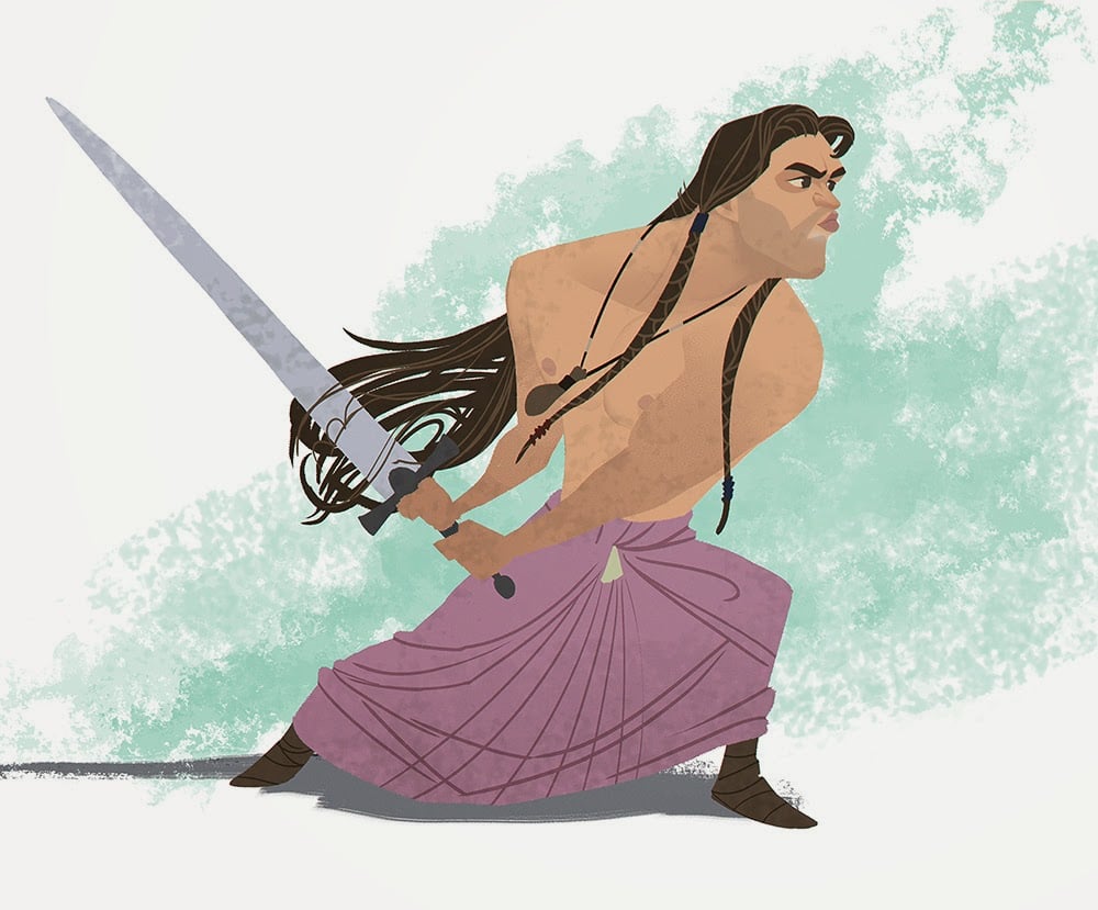
That said, very few characters actually go full baby-face; most mix elements together to achieve a character that combines the right elements of experience, capability, innocence, and development. I picked mostly male examples because I wanted to show that baby-face isn't just used on female characters, although I do think most animated films tend to lean more heavily on baby-faced features for women (not just Disney).
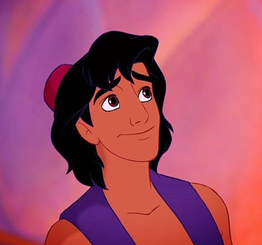 |
| Aladdin's mostly adult shaped face---but with somewhat rounded chin, larger head and baby eyes---supports a character that can be capable and crafty, but also naive and honest-at-heart. |
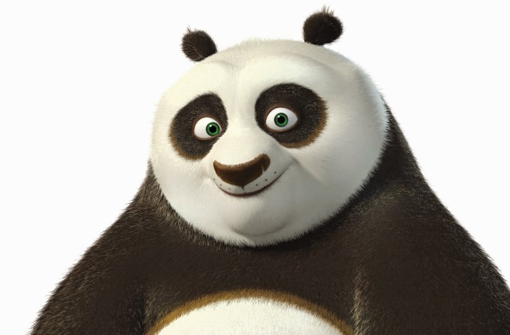 |
| Po=chubby baby. Except the larger brow and broad nose with the arced muzzle, give him the potential for some really aggressive moments. |
 |
| Even the ridiculously baby-faced Elsa is using certain elements to add maturity and a bit of gravity: stronger brow, longer nose, defined chin, half-squinted eyes. |
I'm not expecting this post will settle any debates, but hopefully will give some insight into some of the thinking behind baby-face in protagonist design. I'd love to hear what you think too!
More Toy Story Infinity stuff
 |
| Another mount for Toy Story that was based on Bullseye's rig. |
 |
| I got to work on some of the Zurgbots, with a lot of help from my coworkers. |
Ooh, I'm really scared. No! Don't! There's a---a peck here with an acorn pointed at me!
"You're gonna _what_. HAHAHAHAHA!"
Cintiq 27 QHD Touch review
I bought one of these a month ago, so now that I've put in some hours on it, I thought some of you might find it useful to hear my thoughts.
I've been wanting to get a Cintiq for my home office for a long time, but I wanted something I could easily move from room to room, because I tend to work in every room of the house and not just in my office. The companion is really cool but just way too small---better for quick sketches and drawings than heavy duty professional use. And the others are just big and clunky.
So what sold me is that you could get a no-stand version of the new Cintiq QHD. Instead of a stand, I got this desk, which I could also move around the house and pull up to any couch or chair. I didn't bother to install the wheels on it and I can still slide it around fine.
So what you probably want to know is, should you get it? The answer is maybe. Sorry. I do like a lot of things about it, but first, the things I think that could be deal-breakers for some people:
-It's big. This isn't specifically a problem, in fact I wanted something bigger, but the problem with its size comes because of the distance between the glass and the screen, and the color shifts at acute viewing angles. If you work very close at all, the edges of the screen get a little funny and difficult to use.
-It's heavy. Don't expect to rest it on your lap, even though it's nearly the perfect size for it. Although there have been times when I'll lean the back end against the edge of my desk and the forward edge will sit on my lap. This gets uncomfortable after a while, but isn't too bad for short stretches.
-Touch is terrible. Most of the time it just doesn't work, and the palm rejection is iffy when it does. Seriously, unless it's a driver thing that they are going to fix in a couple weeks (always possible with Wacom), do not waste extra money on the touch.
-Speaking of wasting money, don't pay for fast shipping on Wacom's site. If the site says ___ days shipping, you need to add 4-5 days to whatever that number is, because Wacom takes so long to process your order before shipping. And that money is non-refundable.
-The cables are really long. This is something you'd think would be nice if you're using it multiple places, but the only cable that needs any extra length is the power cable. I don't like having to wrap the super long cables up every time I want to move it.
-The usual Wacom customer service and driver garbage: if you want any new Wacom hardware to work like it's supposed to, you'll be spending time clearing off every trace of old driver files, and probably some time on the line with Wacom customer support. And like any company that has a near-stranglehold on their market, Wacom as a group have limited patience for their customers.
So do I like anything about it? A few things I love:
-It looks nice with the solid surface.
-The screen color accuracy is better than I've seen on a Cintiq so far.
-The magnetic remote for the on-Cintiq buttons is a stroke of genius. This is probably my favorite thing about it. I'm moving it all the time depending on what angle I'm working at, and it's great.
-Being able to lie it nearly flat on a surface is really nice.
-It's a Cintiq and has the pressure, tilt, and rotation sensitivity that have become indispensable to me.
Some day, if Wacom comes up with something that is lighter and a little smaller so I can use it on my lap, then I'll put this up for sale immediately. That said, the fact that it's a Cintiq has saved me many hours already, especially in the drawing stage of projects. But you might be able to find a Cintiq that fits your needs just as well without the extra size and cost. If you, like me, favor semi-portability on something that is more of a serious pro tool than the companion, then you might not have any other option.
 |
| My usual evening workstation, at the couch in front of a movie or TV show. Note the baby blanket in the background, giving the place a much-needed boost in professionalism. |
So what sold me is that you could get a no-stand version of the new Cintiq QHD. Instead of a stand, I got this desk, which I could also move around the house and pull up to any couch or chair. I didn't bother to install the wheels on it and I can still slide it around fine.
 |
| The Cintiq hangs off the edges on the left and right by about 3-4 inches on each side. |
-It's big. This isn't specifically a problem, in fact I wanted something bigger, but the problem with its size comes because of the distance between the glass and the screen, and the color shifts at acute viewing angles. If you work very close at all, the edges of the screen get a little funny and difficult to use.
-It's heavy. Don't expect to rest it on your lap, even though it's nearly the perfect size for it. Although there have been times when I'll lean the back end against the edge of my desk and the forward edge will sit on my lap. This gets uncomfortable after a while, but isn't too bad for short stretches.
-Touch is terrible. Most of the time it just doesn't work, and the palm rejection is iffy when it does. Seriously, unless it's a driver thing that they are going to fix in a couple weeks (always possible with Wacom), do not waste extra money on the touch.
-Speaking of wasting money, don't pay for fast shipping on Wacom's site. If the site says ___ days shipping, you need to add 4-5 days to whatever that number is, because Wacom takes so long to process your order before shipping. And that money is non-refundable.
-The cables are really long. This is something you'd think would be nice if you're using it multiple places, but the only cable that needs any extra length is the power cable. I don't like having to wrap the super long cables up every time I want to move it.
-The usual Wacom customer service and driver garbage: if you want any new Wacom hardware to work like it's supposed to, you'll be spending time clearing off every trace of old driver files, and probably some time on the line with Wacom customer support. And like any company that has a near-stranglehold on their market, Wacom as a group have limited patience for their customers.
So do I like anything about it? A few things I love:
-It looks nice with the solid surface.
-The screen color accuracy is better than I've seen on a Cintiq so far.
-The magnetic remote for the on-Cintiq buttons is a stroke of genius. This is probably my favorite thing about it. I'm moving it all the time depending on what angle I'm working at, and it's great.
-Being able to lie it nearly flat on a surface is really nice.
-It's a Cintiq and has the pressure, tilt, and rotation sensitivity that have become indispensable to me.
Some day, if Wacom comes up with something that is lighter and a little smaller so I can use it on my lap, then I'll put this up for sale immediately. That said, the fact that it's a Cintiq has saved me many hours already, especially in the drawing stage of projects. But you might be able to find a Cintiq that fits your needs just as well without the extra size and cost. If you, like me, favor semi-portability on something that is more of a serious pro tool than the companion, then you might not have any other option.
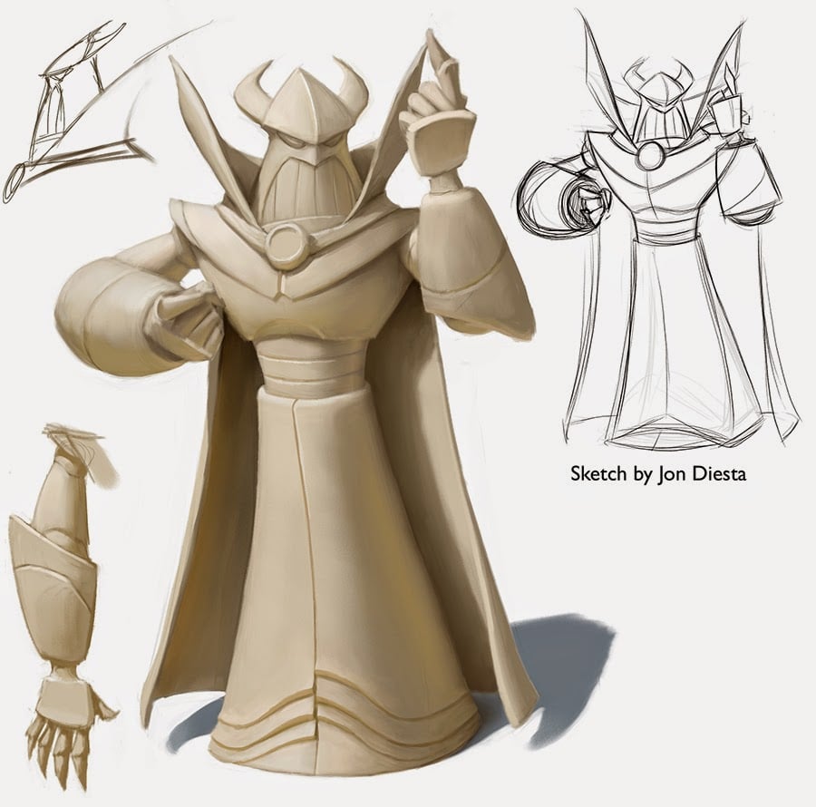
Infinity Buzz and Zurg
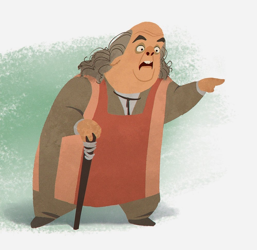
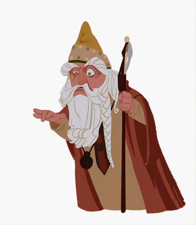
High Aldwin
Willow Ufgood
I was inspired by Matthew Armstrong's cartoon versions of Willow characters. Working on this got me all nostalgic and wishing that Disney would do some sort of remake now that they own the property.
Pre-Infinity Spaceships
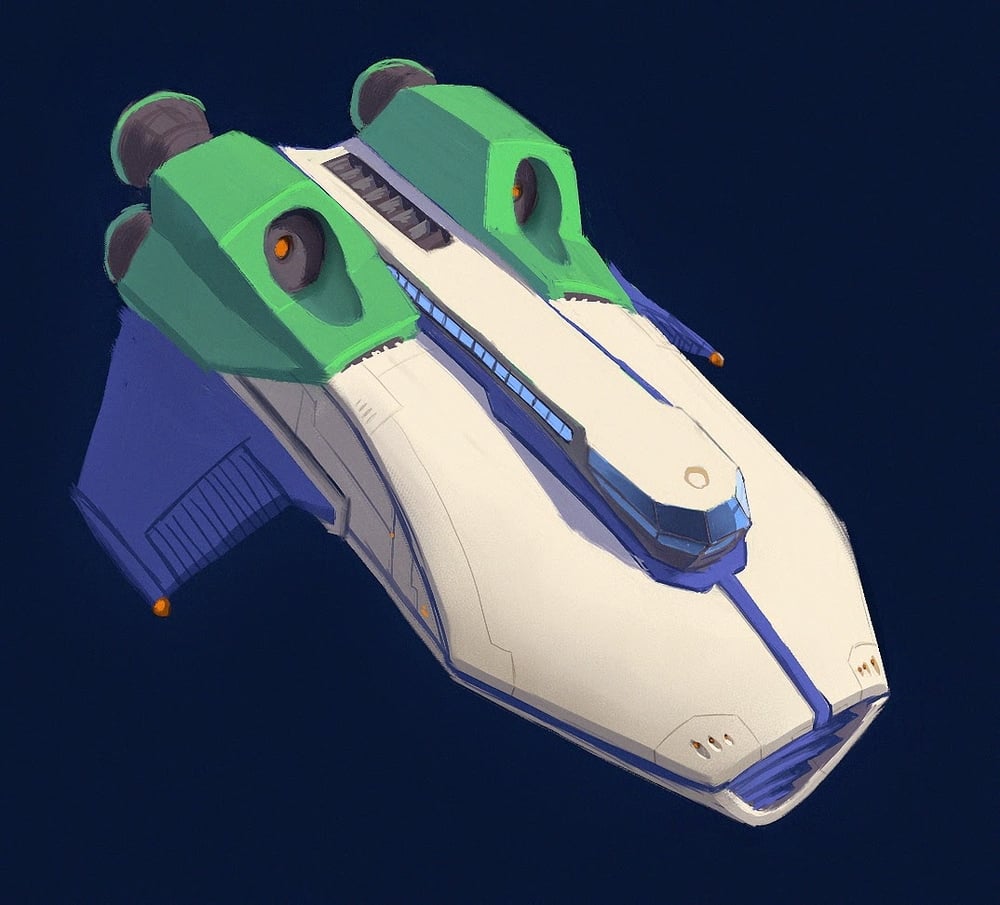
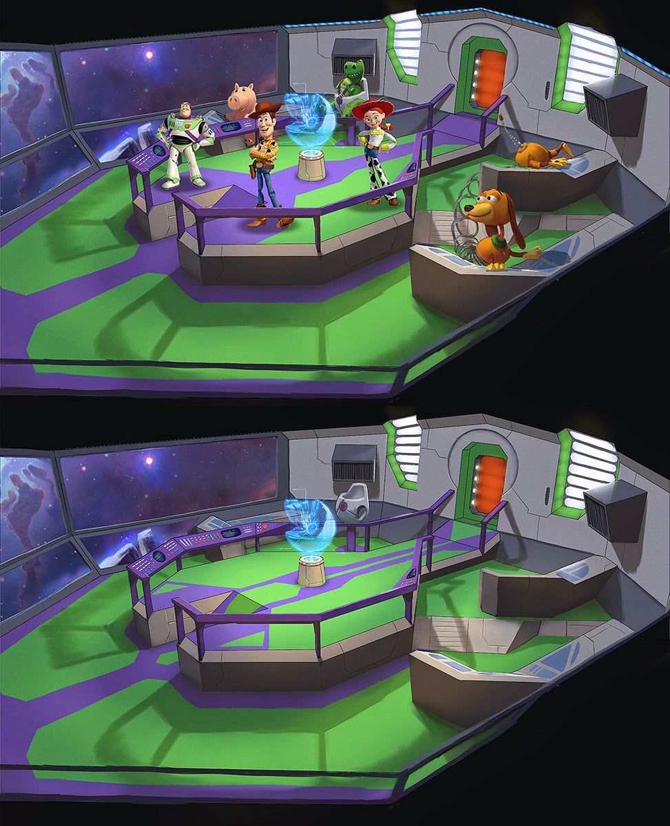
Before we did Disney Infinity, at Avalanche, we were working on a sequel to the Toy Story 3 Toybox that was based in space with the main characters all working for Star Command. During this time I drew a lot of spaceships---not something I'm particularly good at---but I had a lot of fun anyway.
 |
| We were trying to come up with a design that felt like a more massive, starship version of Buzz's spaceship box from the movies. |
 |
| I don't remember what I was thinking here. |
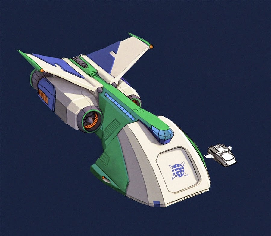 |
| I think this was the one they went with. But it has been a while so I can't remember. |
 |
| A few designs for the bridge of the starship: definitely going for a Star Trek vibe. |
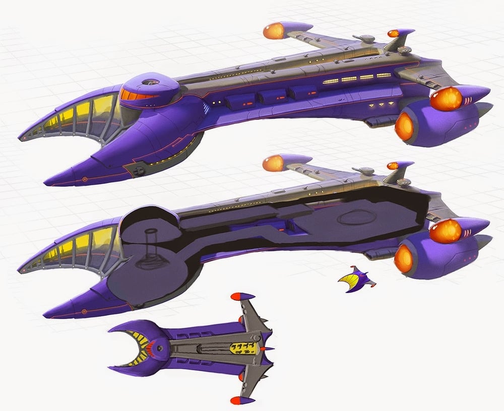 |
| Some Zurg ships. I think the whole concept of using a larger ship level was abandoned before I finished doing the interior layout. |
 |
| This was a revision/caricature of an earlier design by Jason Kim that was used in Toy Story 3. |
Disney Infinity Hulk
 |
| We knew that there should be edges because that's a hallmark of the Infinity style. But which direction should those edges go, and how many sharp edges should there be? |
 |
| These paint-overs of represent the extreme end of our exploration for anatomical detail. I think we backed off just a tiny bit for the final models, as you can see in the final toy photos below. Most of the design work for Hulk came from Jon Diesta and Irene Matar, and I mostly supplied alternate solutions for how to handle details and edges, like in these paint-overs. I believe Bryan Allen did all the final sculpt work on the toy, I believe (correct me if I'm wrong guys). |
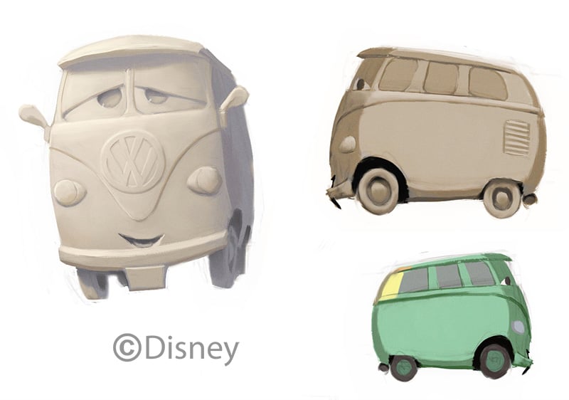
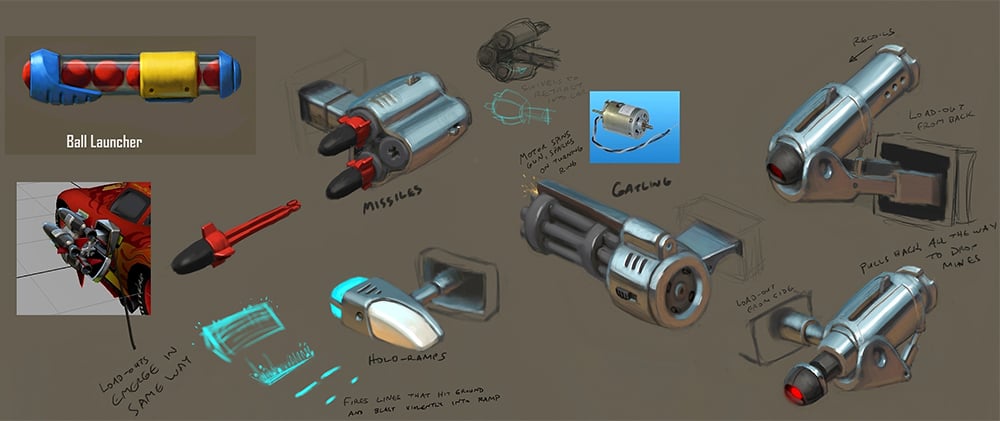
Infinity Cars Re-post
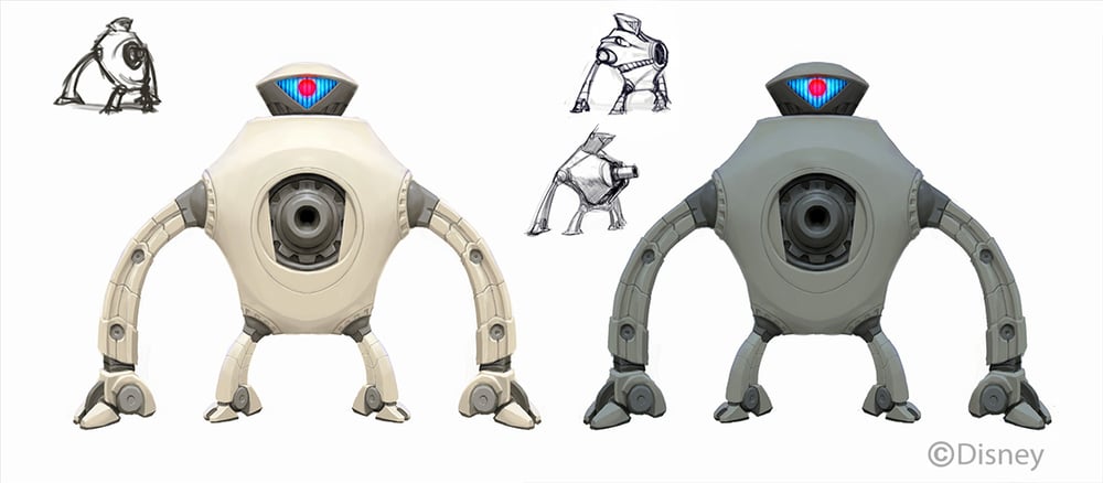
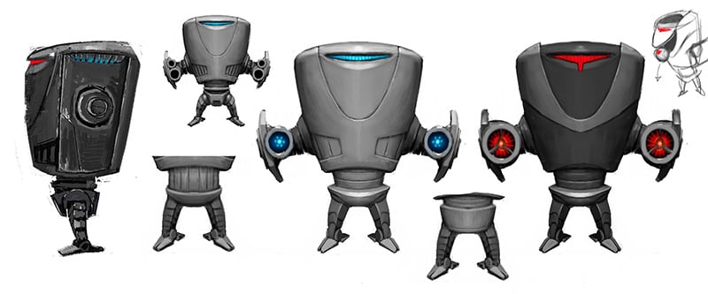
Re-post of Infinity Incredibles Omnidroids
I had to delete these a while ago but I've been cleared to post them again.
I didn't design all the versions in this line-up, I think Jason Kim did the ranged guys but I honestly don't remember who did the revisions on the others.
The left design here is Jason Kim's and so I was trying to figure out the front view.
Infinity Mickey
Redesigning a beloved icon is always a bit terrifying. Redesigning Mickey Mouse was a step above that. I struggled a lot with this one, but luckily we had one Mr. Jason Kim, who seemed to really understand what Mickey was all about, and who pushed his design to the point where I just had to figure out forms and edges. He really deserves most of the credit on this but my guess is that he won't brag about it so I can do it for him.
We went with a different pose in the end, and Jason made some further adjustments to the design along the way, as you can see with the final figure design (this is a marketing image, but pretty close to the figure):
Presenting at Video Games Symposium
If you're in the area this Friday (Feb 13), I'm doing a couple things at the Video Games Studies Symposium held at BYU.
First of all, I'm doing a presentation called "The Mad Science of Visual and Gameplay Design" from 12:30-1:30pm in F201 of the Harris Fine Arts Center. I'll be talking about things I've learned over the years as an artist and gameplay designer at Disney and elsewhere, and how to find a fusion between the two disciplines. I'm going to show some cool stuff that nobody has ever seen before and if there's time, I might even go through some design process thoughts.
Then from 7-8:30pm in the same room, I'm going to be the moderator of a discussion between some industry-leading (not exaggerating) professionals---including Jeff Bunker, the art director of Disney Infinity and the Tak and the Power of Juju series; and Adam Ford and Geremy Mustard, creators of Infinity Blade I-III. Don't miss this one.
More information here!
http://videogames.byu.edu
I think you can follow event updates here also:
https://www.facebook.com/events/359349160915208/?ref_newsfeed_story_type=regular
Early Infinity 2
With our earliest work on the Infinity 2.0 stuff, we were trying to keep the Marvel characters more in the style of the rest of the Infinity characters. Of course, Marvel would have none of that, but I personally still prefer some things about these versions of the characters. Jon Diesta deserves most of the credit with his strong sketch of Iron Man, but I did get to help resolve the forms and details a bit under his art direction. That guy has a pretty amazing sense of design.
Here is where the final character ended up, for comparison.
Infinity Anna
I hear it's okay for me to post Disney Infinity stuff again, so there will at least be something for me to post while I'm buried in other projects.
Here are a couple takes on Frozen's Anna. This was based on some earlier concept art, then we revised her look as we got more information. The far right are my first sketches, then the middle came next, and the one on the left last, with some help getting the pose right from Jason Kim.
Images copyright by Disney.


