More ink drawings
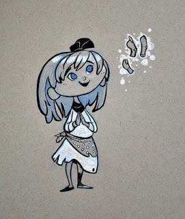
Listen to the Fingers
Wonder Woman
Some of the concept guys at work drew Wonder Woman, so I did too. I wanted a Bruce Timm vibe but I made a few elements more realistic than I should have for that feeling. I think I got caught between the style of the figure vs. redesigning the costume to something that could be used for live action.
Hide and Seek
I taught at the Masters of Digital Painting workshop in Moscow earlier this month by invitation from Max Kostenko. At the workshop, Denis Zilber taught about light, and Serge Birault taught techniques of pin-up illustration. I talked about some rules of composition and then did a demonstration on controlling a composition, starting with this image, which I deliberately made a bit over-detailed and convoluted:
I took the picture to this point during the workshop:
It could be worse, but it's still a mess, right? Almost every artist runs into problems like this sometimes, so I wanted to show how to sort through a flawed and complicated composition.
I took the picture to this point during the workshop:
Unfortunately, there wasn't enough time to do more than push the values and colors around. I've spent a couple hours on it since then, trying to take it where I thought it should go. There is one thing still bothering me, but I can't figure out how to fix it without damaging the theme and integrity of the picture.
I've taught before that when you can't control the size at which people will view a piece (like when posting it online, where you can't control monitor size or other things like level of zoom), you should design your composition to read clearly at almost any distance. But when I tried making the silhouettes clear and cropping it so the boy was visible at smaller scales, it lost that epic sense of exploration that I wanted.
Not to mention that obscuring the monster a bit feels right for a game of hide and seek---in fact I may have pulled him out from the background too much as it is. Anyway, the point is that this one is meant to be seen large so make sure to click on the image. Sorry, thumbnail-aficionados! I guess I have to conclude that no set of rules can cover all compositions.
 |
| A stronger composition? Maybe, but I still like most things better in the other one. |
Thanks to all the people who came to the workshop and made me feel welcome in Russia. It was fun!
Catdog
Photoshop Brushes
 |
| I wondered what would happen if I used every brush in one image. I guess this is the answer. |
Drawing: brushes that work well at small scales and for details
Gradient: brushes that are good for making a smooth shift in colors with minimal "banding"
Edge: brushes that can easily create an edge
Blending: smudge tools that help smooth banding or introduce distortion to smooth areas
Texture: brushes that create strong textures
Feature: brushes used as a shortcut to create specific things (ie. trees, chains, windows, etc.)
I'll talk about each of these separately, except feature brushes, since they are so highly customized. I've included a link at the bottom with the brushes I used in this post. Copy the file into the appropriate photoshop\presets\tools folder and you can access it from your Tool Presets window/menu. I like tool presets because they contain all of a tool's information (not just stuff in the brush menu) and can be used for things like the smudge tool.
Drawing Brushes:
 |
| This conte brush is from Simini Blocker's brush set. Thanks Simini! |
Gradient Brushes:
 |
| Jason's Nice Brush from Jason Kim, Rounded Square modified from Tom Scholes, Spatter Soft from Chris Wahl, and Oil Brush from Blur's Goodbrush set |
Edge Brushes:
 |
| Square Chalk from Blur's Goodbrush set, link above |
Blending Brushes:
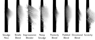 |
| Some of these have been modified from other sets, but I don't remember well enough to track them down. Sorry. |
Texture Brushes:
 |
| Dappled Texture from Ben Simonsen, Heavy, Paint Texture, and Spatter Airbrush from Blur's Goodbrush, Scribbles from Chris Wahl, Tree brush from Jaime Jones, I think |
Download my tool presets here (installation instructions above). I'm going to do another post later with my CS6 brushes, which include some more interesting options.
Happy
Well, it happened: I've switched almost exclusively to Photoshop. I've always kept PS around for various abilities it had, but when they got me a Cintiq at work, I found the lag and selection tools in Painter started to grate on me more and I discovered some Photoshop brushes that made the painting process less painful. It's too bad really, because Painter has some features I miss, and the Adobe team doesn't seem to have any interest in ironing them out (I'm looking at you, Mixer Brushes!). Maybe some day soon the Corel guys will make a more stable product and I'll switch back.
So anyway, here's something I painted exclusively in Photoshop. Some time I'll talk about how I've had to change my process with PS and share my tool set.
WoW TCG Illustrations
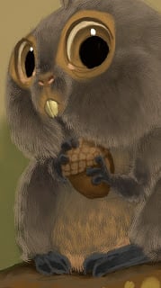
I wasn't sure when these released so I was afraid to post them until I'd waited for a good while. As you can see, the epic cards are assigned to epic artists, and the bunnies and pigs come to me. :) Seriously though, the WoW card game guys have been great to work with and I'm happy to get the squirrel-y assignments.
Making a game, making toys
 |
| This figure is 3.5 inches tall, I think. I prefer them without color, actually! |
He addressed a lot of things that have annoyed me in the news I've read about the game. Our goal has been quality and experience all the way so that when people reduce what we're doing to "a Skylanders clone" it's painful.
He took the above photo and I'm glad he did: without the paint you see how much care we put into the sculptures of the toys. I was just one of many artists that worked on Jack Sparrow, and I can promise that there isn't a millimeter of these toys that wasn't deliberated over and redesigned a hundred times until it was perfect. Hopefully I can show some of the concept progress and other sculpts soon.
Disney Infinity
Today the game we've been working on was announced! This is why I've been mostly MIA here for the last little bit:
These characters were brought to life by a talented team of artists that I'm proud to be part of. So yeah, I've been basically working on fan art for the last several years! Not only that, but the game is turning out awesome. It's pretty exciting. Here are a few good articles on the announcement:
I'll post more art as I find out what's okay to show at this point.
Sculpting with light
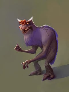
Ugly monster
Some life drawings
Some of my favorite results from previous months of Friday drawing sessions. I've gone to many sessions in that time, but most turn out terrible. I'm usually showing up late so these are all between 15-60 minutes.
 |
| We didn't actually use a red light (that would have been interesting), I just wanted to paint values but didn't want to go monochromatic. |
Style and Priorities of Emotion
In a previous post, I mentioned a hierarchy of effectiveness:
(Most effective)
1. Style
2. Subject matter/content (I might include shape language here)
3. Lighting scheme
4. Value/color composition
5. Surfaces/Textures
6. Color scheme
(Least effective)
 |
| See how easily a change of style makes "terrifying" become "spooky lite"? Style fundamentally changes the equation so that compensating for it with the other factors becomes difficult. |
In this way, each item in this list can set the context for the thing after it. If I used a gritty style, but then the subject was a happy puppy, then every choice I made with lighting, value composition, and even surfaces or color would be seen through the lens of that subject matter. The subject matter also dictates what range of surfaces can be used---I can't change the fur of a puppy to something else or it won't be a puppy anymore. And because it's a happy puppy, covering the fur with slime merely makes the puppy look a little naughty.
I use the word "can" because sometimes design decisions themselves are neutral or weak, like with lighting, which can be easily used in a way that doesn't modify the rest of the list. Sometimes keeping one element neutral so another element can show through more strongly is the way to go. Likewise, some subjects are just neutral by nature and we have to push on other factors to say something about them.
 |
| Shifting every element (including style) to communicate a clear message |
 |
| Mixed messages---appropriate for a more nuanced character |
Teinoscope
I forgot to post this poem that my wife wrote which inspired me as I was working on the last painting. I think it speaks to what it means to be an artist, and why I see the work we do as valuable even when we're not what academia might consider a "fine artist." I hope some of you can read it and feel similarly inspired about your own work as artists.
Teinoscope
(Physics) An instrument formed by combining prisms so as to correct the chromatic aberration of the light while linear dimensions of objects seen through the prisms are increased or diminished; - called also prism telescope.
I have seen you standing still beneath
rapid clouds at dusk, collecting the light,
drawing the gathered radiance in like breath.
You store it everywhere—as lines, faces,
in crowded notebooks—till it spills out, bright,
new-made. Is this creation, these mixed pieces,
When patched-together, conglomerate, they
emerge like sparks from your hands, lightened
and whole?
Some men stockpile days
Like weapons, against the cataclysm.
From you, the stored scraps of collected light
leak like constant suns. And what wrought prisms
allow these sudden visions: myself, made
larger and more beautiful, all the bright
fragments ripened and mingled, naked, laid
like webs of stars together? Those saved skies
reflected back to me, mirrors on mirrors,
A tiny universe within your eyes?
Calm
Mariachi Dachi
I just wanted to draw your attention to an awesome comic done by my friend Kevin Merriman. He gave us an early preview of it and the story and art are both chock full of entertainment.
You can check it out here.
You can check it out here.
 |
| Sorry, you can't click to look inside here. Follow the link above to do that. |
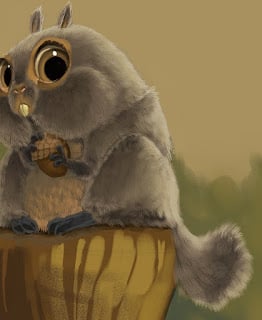
Squirrel Process
I had a couple people ask about my process recently, so here's a breakdown of how I paint (sometimes). My process is usually a lot messier than this, but these are the steps I jump around between:
 |
| I'll start most paintings with big flat colors. I usually start by filling in the background with a color that I wouldn't mind peeking out between the strokes (because that's what it's going to do). |
 |
| I usually paint in the background in that same step, but if I were more disciplined I'd paint it first behind the character. Here I used a Darken layer on top of the squirrel layer. |
 |
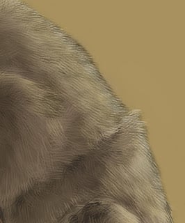
| At this point if I'm doing a tricky surface type like fur, I'll lay in where the major areas of texture and value will be. Here I also roughed in the acorn texture. |
 |
| I still felt like the fur was too flat, so I put in a 50% layer of a dark black-red. |
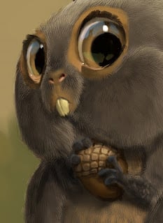 |
| At this point I put in the final touches: refining edges, catching textural details where important, etc. |
 |
| I have a habit of painting with less saturation and contrast than I really want, so I'll make a few adjustments before I call an image done. That's it; hope it's helpful to someone! |


