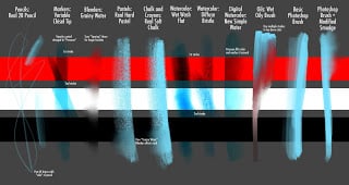
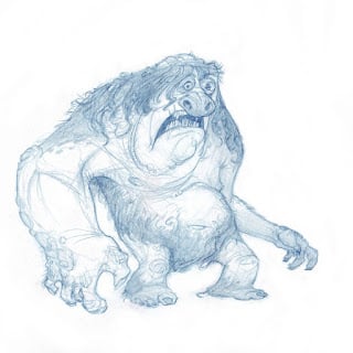
I used to paint mostly with custom brushes, but my old custom brushes aren't very practical for demonstrations since they confuse new students. So when I bought Painter 12, I branched out into the stock brushes some more. Here are some of the ones I liked: some new to Painter 12, some that have been around for a while, and one or two from Photoshop.
First of all, the "Real 2b Pencil" from Painter 12. This is the only thing I use for drawing now, except occasionally the markers. Why? Because it feels exactly how you would want a digital pencil to feel. The only problem with it is the fat Wacom pen's inability to lay completely on its side like a real pencil would. But once you get used to it you'll never go back. And it's a "cover" pencil so you can draw with any color.
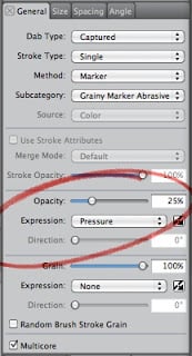
Painter 12 finally got markers right. I like quite a few of the new markers, but my favorite is the "Variable Chisel Tip," only I changed the Opacity control to pen pressure.
The new markers basically treat a single stroke all as wet ink, and don't layer on new color until you start a new stroke. If you've used art markers before you'll immediately feel how much better these are than Painter's old markers.
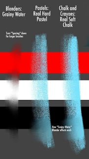
The next brush has been around in Painter for a while, but they've improved it just slightly for 12: the "Grainy Water" Blender. Something about the way it blends feels really intuitive, and best of all, if you're blending line art, you can see the original lines underneath just like you do when blending natural dry media. Lately I've been using this brush instead of an eraser when drawing, because the unique way it blends gives you a very natural feel.
The "Grainy Water Blender" makes two brushes I would have avoided before suddenly become pretty nice: The "Real Soft Chalk" and "Real Hard Pastel." The former is ideal for mixing and adding depth to your colors, the latter gives you a nice opaque color with some texture when blended.
One inherent problem with digital painting is that it will never feel as tactile and "right" as natural media. However, digital media DOES provide extra controls and options that you may not have with, say, something like watercolor or oil paint. So why did the Painter guys make their new Watercolor and Oil brushes even MORE painful and unpredictable than their real-life counterparts? I don't know, but I'm going to recommend you use some of their older brushes instead.
The watercolors Painter 10 (or 9?) introduced are mostly just useful for adding texture to your image. I really like the "Diffuse Bristle" for that very purpose. If you absolutely must use the new watercolors for actual painting, the "Wet Wash Flat" isn't horrible. But if you want something that does what I described above, in mixing some of the benefits/feel of natural media with the power and flexibility of digital, use the Digital Watercolors. In my last post on brushes I think I liked the "Simple Water" best. Well, the "New Simple Water" is even better. Digital water color is best for adding color to an existing drawing, like this:
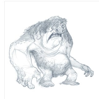 |
| Original drawing |
 |
| Fine details added using Real Soft Chalk and Grainy Water Blender |
My favorite part: low pressure pushes the colors around and pulls some of the color out, much like the behavior you'd get when switching between a wet brush dipped in color and a damp brush. If you want to have more than one layer of digital watercolor at a time, create a new layer and turn off "Pick Up Underlying Color" in the layers menu. If you want to dry the digital watercolor (merge colors with the canvas) for any layer, the option is in the Layers menu.
The new Oil brushes are garbage, for the same reasons I cited above: less intuitive than the real thing, and nothing new added by making it digital. Maybe a little less expensive and fewer health risks, but Corel could definitely do better than this. The biggest problem is that none of the Oil controls can be attached to pressure, pen tilt, or any other Wacom settings.
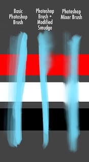
I thought I'd throw in an addendum for Painter users who are curious about Photoshop CS5, or for Photoshop users who want the same results as Painter. I'm sorry to say that for the most part, Photoshop does everything differently than Painter does. It is possible to make a Painter brush feel exactly like Photoshop, but getting Photoshop to mimic most Painter brushes is just impossible. Photoshop does a few things well, like the way it handles Dual Brush effects and texture. But its brushes don't scale well, making edges hard to manage, and its Mixer Brush Tool doesn't live up to hype. In fact, CS5's Mixer Brush reminds me a lot of Painter's Oils, and you know how I feel about those. You'll get much better behavior from modifying your smudge tool (which isn't as good as the Grainy Water Blender in Painter, but it's way better than the Mixer Brush settings for blending).
