
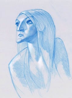
Grayscale
Thank goodness for the Avalanche drawing session---it's the only thing keeping me drawing things outside of regular work these days. This one is about an hour of work. I did a body too, but I thought the image worked better cropped.

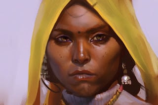
Friday Painting
I wish I could post more, but I'm so busy at work right now. But here's something I did in our figure drawing session. It was meant to be a caricature, but I think I ended up normalizing him too much as I painted over the drawing.

Another quick caricature
From our figure drawing session. This one look closer to 15 minutes, then I spent a few adding in the highlights after I scanned it in.
Meager offering
Sorry for so few posts lately. I've been extremely busy at work, and we've been in the process of moving at home (we've actually been in the new house for a couple weeks now, but there are always so many projects after you move).
I could only dedicate ten minutes to the figure drawing session this morning, but the model had such an awesome face I just had to exaggerate it a little.

A tribute. . .
. . .to my favorite faces on our local NBA team. I wanted to spend more time refining the likenesses, but I decided I'd better finish it quick since the Jazz aren't looking so great against the Lakers right now. The players depicted here are (left to right) Carlos Boozer, Mehmet Okur, Andrei Kirilenko, and Deron Williams. I thought Deron's likeness would be easier to capture because he looks like a baby monkey, but he ended up being the hardest one---I'm still not happy with how he turned out.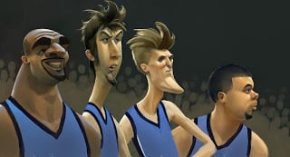
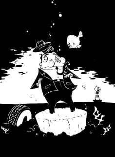
War Machine

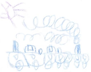
Choo-choo-chrain

Friday drawing session

Drawing session and Ace in Action concept
I was experimenting with color in this morning's drawing session, but I could never get the skin tones to work quite right. I feel okay about the picture anyway, but just in case it's not enough I'll include some conceptual development from Chicken Little: Ace in Action. This was the original design for Abby's fighter, before they changed it to a hovercraft. I wanted her ship to mix the trendy feminine Volkswagon Beetle-esque look with the military purpose of her fighter.
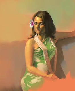
Friday drawing session doodlery
Some drawing session paintings just work, and others I decide aren't worth posting by themselves. The smart part of my brain says that means I shouldn't be posting them now either, but the stupid part of my brain hopes that nobody will notice even though I'm drawing attention to their deficiencies. I do like lots of things about these though, despite their various problems.


Cinderella's father
For those who were guessing, the version I'm noodling around with is Prokofiev's Cinderella. My wife and I went to see the ballet here a while back, and I've been obsessed with the idea of fleshing out a storybook or animated version ever since. What I find most interesting about Prokofiev's version is not only its unique variation on the story, but the sort of wistful tension that exists throughout the music, even in the playful and happy parts. I haven't found an appropriate style to match the mood of the music, but I'm working on it.

In Prokofiev's Cinderella, her father is still alive, but he's too old and broken in spirit to prevent the abuse she suffers. I like to picture that his weakness comes only partly because of age---so my idea is that he never quite recovered from the grief of his first wife's death, and the oppressive nature of his second marriage has worn him down completely. I wanted him to look like a lord or duke of some sort, someone whose family would be invited to the Prince's ball, and whose moderate wealth would attract the attention of an ambitious lady with spoiled daughters. I tried to reflect all these ideas in the design of his face.
Sorry the colors are so muddy, but I did it quickly (and figured it worked for someone who had lost the will to live anyway).
Character design doodles
I wanted to give people a peek at how I develop my character designs---lots of drawings, writing ideas in the margins, thinking about how to tie the look of the character to his/her personality and purpose, developing the costume designs, etc.
This is for a personal project I'm working on (mostly for fun). 5 points for anyone who guesses the project, 100 points for guessing which version I'm doing.


This is for a personal project I'm working on (mostly for fun). 5 points for anyone who guesses the project, 100 points for guessing which version I'm doing.
Avalanche drawing session
I went to the drawing session this morning and tried to apply some of the things I've been learning lately from the tutorial sessions by Adam Ford and Dave McClellan. I painted this almost entirely with Painter's "Loaded Palette Knife," because I wanted a different effect than in my usual paintings.
Lunch study
Some guys at work have been doing these studies during lunch, and I was happy about the way this one turned out, so I'm going to post this. Done from photo reference, no color picker, about 45 minutes.
I'd post the photo, but I don't know if it's copyrighted, so you'll just have to imagine.
Gangster progress shot 2
I want to spend a lot more time adjusting how the values work on this thing, but I need to post something.

Another gangster
Gangster progress
I'm working on this for the Avalanche blog. I've been really busy at work and haven't had much time to do things for this blog, so I'm going to post progress shots of this piece, and hopefully someone will find it useful.
This is inspired by a tutorial/training Ryan Wood has been doing at work, so I'm trying something a little different. I did this drawing while standing on the aisle of the bus in heavy traffic last night, but that's not why it's messy. That's just how I draw.

Cute Baby
I did this picture of our newborn son for his birth announcement. I'm not usually good at drawing babies or kids, but I like how this one turned out.

RANT of the Week: The Power of Shape
Shape is my favorite design principle for good reasons. Two of the most essential laws of design are unification and contrast (and no, I can’t substantiate using the term "laws," but I’m going to anyway, because I’m right, darn it). Unification deals with the visual continuity of a design, and contrast deals with the differentiation of qualities across that design.
First, let's assume that the goal of character design is appeal. And from what I’ve seen, the character designs people find most appealing are 1. Easily read and understood, and yet 2. Have some unique or unpredictable qualities. People like to feel some familiarity with a character, but they expect to see something that feels new. The law of unification can make designs readable, tying even complex designs together in interesting ways. The law of contrast also improves readability by placing emphasis on what’s important and diminishing what isn’t, but also, the right contrasts can generate that sense of uniqueness and unpredictability. Balancing unification and contrast is hard, but they’re important in creating appealing characters.
Fortunately, while balancing the two laws is tough, the principle of shape can be a powerful tool for working unification _and_ contrast into a design. You can unify a design using echoing shapes, complimentary shapes, interlocking shapes, or shapes that share contour lines. You can then add interest to the design using shapes of contrasting size, type, rotation, proportion, and spacing.

These examples are from a side project I volunteered for. I wanted them to draw upon stereotypes—so I didn’t add a lot of unpredictability to the content of the characters. Instead I tried to put interest into their shapes and other elements. With the Igor character, I used like shapes to unify the character and reinforce his heavy, dejected persona. I used a variety of shape sizes, however, to add that little bit of visual interest. I also spaced the shapes unevenly to add some unpredictability. The mad scientist, on the other hand, uses a larger variety of shape types, but they are unified by fitting them within his squarish frame. I also used connecting contour lines to pull the shapes together. The woman uses both like and varied shapes, and contour lines connect them together. I'm not sure the other designs are worth talking about, and that baby is just disturbing.
Well, sorry if that was long. Hope someone finds it helpful. Or even if it sparks discussion, good. Either way, it's always fun writing these.
First, let's assume that the goal of character design is appeal. And from what I’ve seen, the character designs people find most appealing are 1. Easily read and understood, and yet 2. Have some unique or unpredictable qualities. People like to feel some familiarity with a character, but they expect to see something that feels new. The law of unification can make designs readable, tying even complex designs together in interesting ways. The law of contrast also improves readability by placing emphasis on what’s important and diminishing what isn’t, but also, the right contrasts can generate that sense of uniqueness and unpredictability. Balancing unification and contrast is hard, but they’re important in creating appealing characters.
Fortunately, while balancing the two laws is tough, the principle of shape can be a powerful tool for working unification _and_ contrast into a design. You can unify a design using echoing shapes, complimentary shapes, interlocking shapes, or shapes that share contour lines. You can then add interest to the design using shapes of contrasting size, type, rotation, proportion, and spacing.
These examples are from a side project I volunteered for. I wanted them to draw upon stereotypes—so I didn’t add a lot of unpredictability to the content of the characters. Instead I tried to put interest into their shapes and other elements. With the Igor character, I used like shapes to unify the character and reinforce his heavy, dejected persona. I used a variety of shape sizes, however, to add that little bit of visual interest. I also spaced the shapes unevenly to add some unpredictability. The mad scientist, on the other hand, uses a larger variety of shape types, but they are unified by fitting them within his squarish frame. I also used connecting contour lines to pull the shapes together. The woman uses both like and varied shapes, and contour lines connect them together. I'm not sure the other designs are worth talking about, and that baby is just disturbing.
Well, sorry if that was long. Hope someone finds it helpful. Or even if it sparks discussion, good. Either way, it's always fun writing these.