RANT of the week: Caricature

Okay, I've got to get something out of my system. Throughout my classes today, I noticed many other people working on this caricature assignment. Some of them were either taking the assignment lightly or complaining about its relevance to character design. I'm not a great caricature artist, but I believe strongly in its value to character designers. So this post is for all those in my class who don't believe caricature is important:

In my opinion, caricature is the ultimate design exercise. Think about how these elements are used by the very best caricature artists:
Line.
Shape.
Proportion.
Form.
Texture.

That list sounds familiar, hopefully! Caricature isn't just about distortion, recognition, and good rendering.
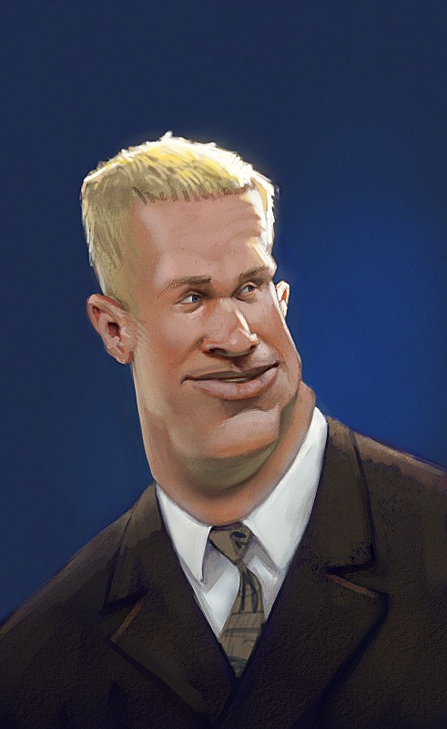
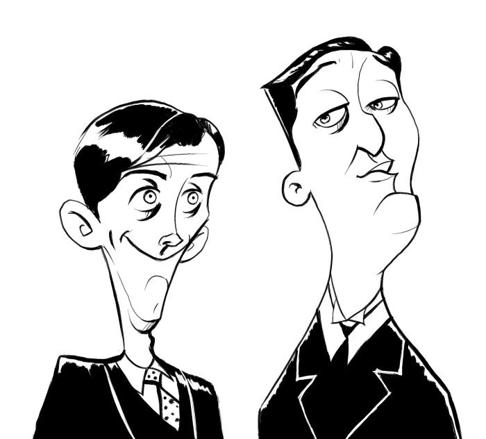
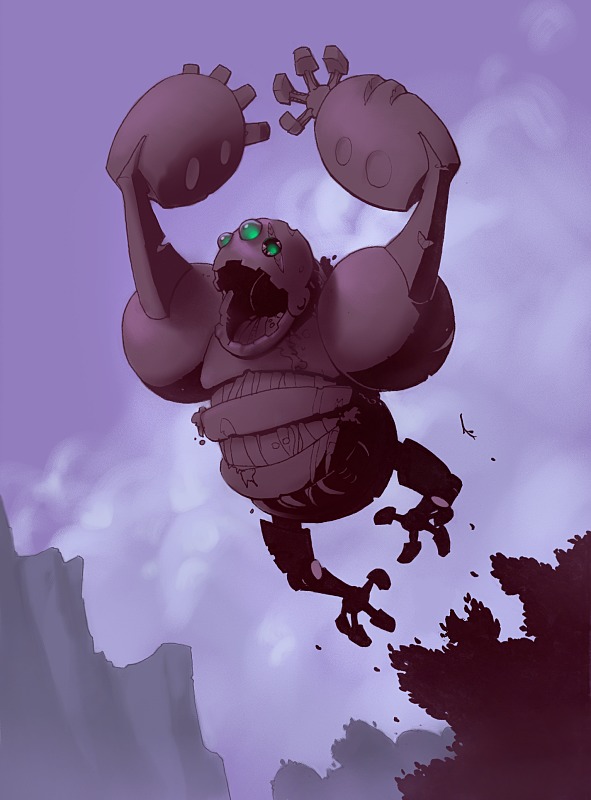
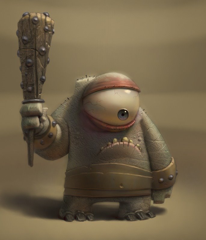
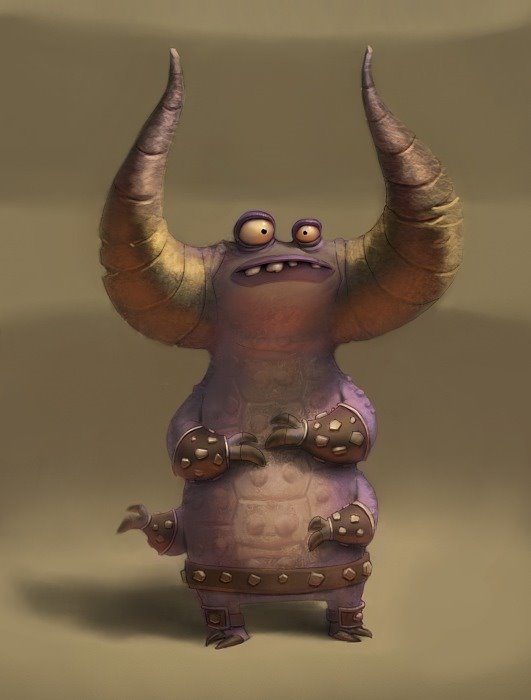
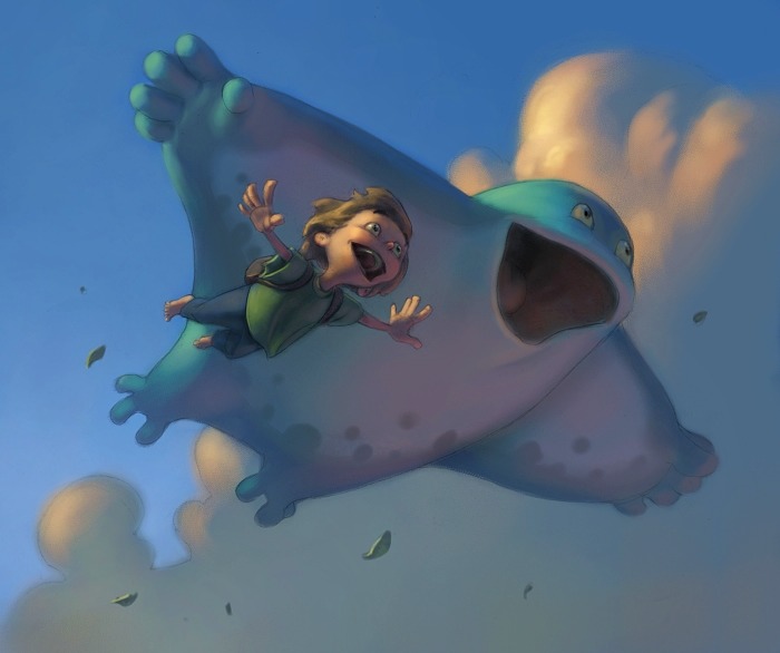
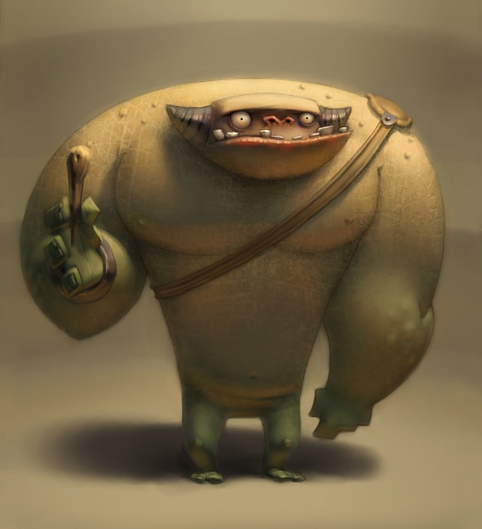
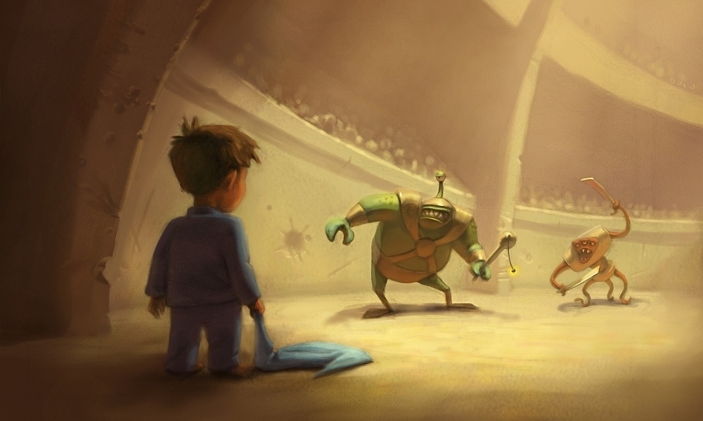
Good caricature is really about finding just the right design element(s) that simultaneously give a character both recognition and appeal. This same principle applies to object and environment design. Usually in entertainment, audiences have only a split second to register what they are seeing, so recognition is essential. But recognition isn't enough by itself, since audiences lose interest quickly if what they see isn't appealing.
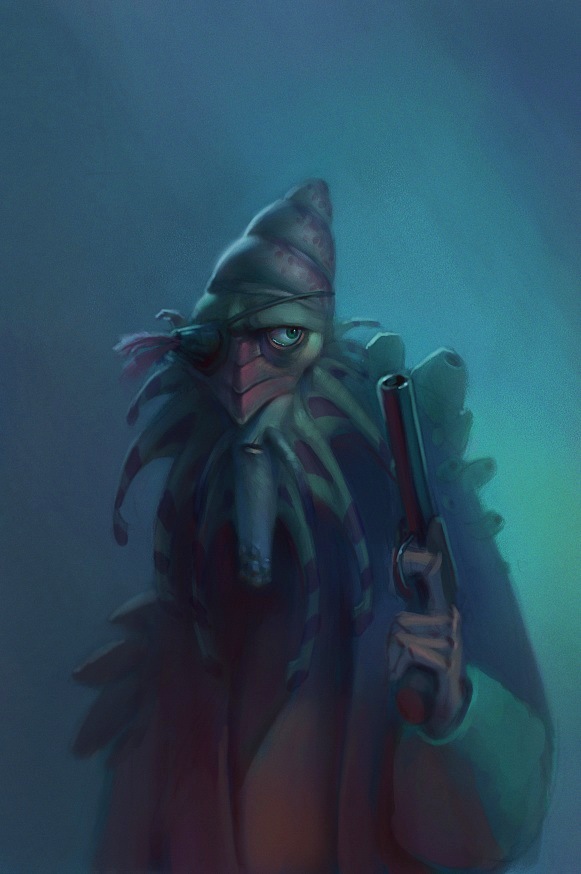
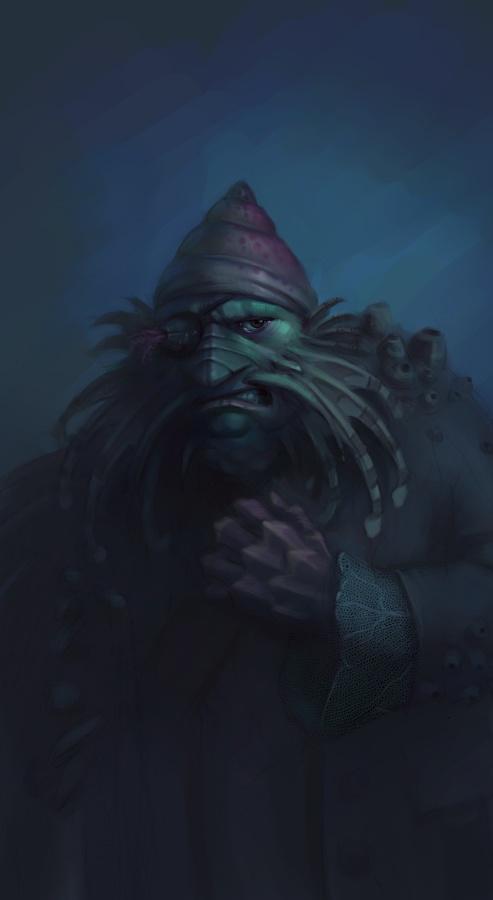
Sebastian Kruger isn't a great caricature artist just because he renders details so well. I think his caricatures would be just as effective even without his insane painting ability, because he efficiently uses basic design elements (such as shape and line) so that they simultaneously bring recognition and appeal to his characters.

For examples of how the principles of caricature result in good character design, look at the work of Stephen Silver, David Colman, Shane Prigmore. I could provide a much longer list, but I think I've gone on for long enough now.


EDIT- A couple more thoughts I had this morning:
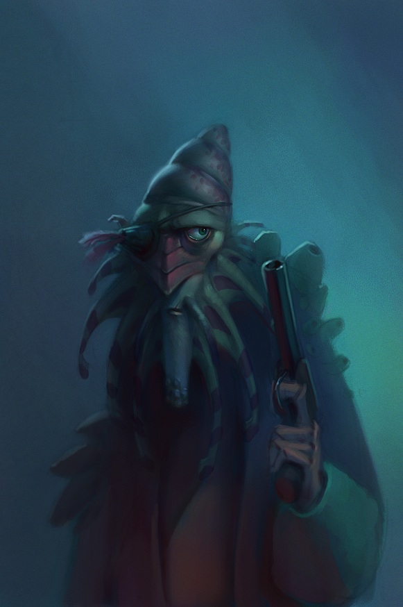
The very best live-action film designs also use a type of low-level caricature in their costume designs and makeup to make them easily readable and more appealing. The Pirates of the Caribbean movies are a good example of this.
There are a lot of bad caricatures out there---I'm sure you see them all the time. These caricatures are usually recognizable, and the people who draw them can feel proud for getting that part right. However, a drawing a million such caricatures won't make those people into good character designers because they aren't using the principles of design correctly, and their focus is usually only on recognition and not appeal. What I'm trying to get at is if caricature is exercise for designers, then the principles of design are the weights. If you're serious about design, you can't treat caricature just as a way to get cheap laughs.

Caricature assignment

This week's assignment was to do caricatures. Since this is the second time I've taken the character design class, the teacher let me choose my own subjects.
I'm a big fan of BYU football, and so I thought it would be fun to try the head coach, Bronco Mendenhall. Unfortunately, there's not a ton of photo reference available of him on the web, so I'm not sure how close I came to his likeness.


I also like the BBC series "Jeeves and Wooster" with Stephen Fry and Hugh Laurie. I don't think my likeness of Bertie Wooster is all that great, but I'm pretty happy with Jeeves. Also, I think I'm in love with Painter's "Dry Ink" brush.


I'm also working on Miranda Otto (I also like the Lord of the Rings movies), but I'm probably not going to finish her until just before the assignment is due.

Arena Lighting and Surfaces

Well, I finally finished it. Like the kitchen, I feel like there's lots of things I could fix if I spent another 20 hours on it, but I feel like it's just not worth the effort. Hopefully it gets the necessary information across anyway.

Char. Design assignment: Shape Drawings & Nature

The first part of the assignment was to draw loose shapes and then make them into character designs. It's definitely a fun creative exercise, but I think the most useful part of it is how it forces you to play with proportions. Since the dimensions are already set out for you, the challenge becomes to determine how to arrange things within that shape to make your character the most appealing. I can't say that I was entirely successful in picking the best proportions for these guys, but it was a lot of fun anyway.


I forgot to scan in the original shapes, so I included quick trace to show what I started with.


The other part of the assignment was to (after doing some drawing from nature) do some character designs incorporating elements from rocks, trees, and clouds. We had two photos we were supposed to base the character designs off of, which I didn't scan in. I didn't really use anything from them anyway, other than a loose gesture of the pose. Edit: Here's one of the pictures, anyway. No matter how hard I try, I can't get the rock guy to upload. Maybe later, then.

Tip of the Week: Matte and Specular Lighting

Figuring out how to correctly "model" objects with light has been one of the most difficult things for me. The thing that helped most was to learn the differences between how light interacts with matte and specular surfaces.
When painting a surface with both properties it sometimes even helps to deal with the properties of each separately, maybe even using layers.

Matte surfaces reflect light of their own local color (red objects reflect red light) and absorb all other frequencies. How much light they reflect depends on the surfaces' angle with respect to the light. If you treat a smooth surface like it is faceted, the faces that are angled most toward the light are brightest, and become darker until they are parallel with the light source. Any faces angled AWAY from the light source receive NO DIRECT LIGHT from that light source. The brightness of these faces will be the same regardless of the viewer's position. Here's an (ugly) example:


Specular surfaces, on the other hand, act just like mirrors and will reflect all colors of light regardless of the surface's local color. In fact, a specular highlight is really just a low-level reflection of the light source. Because of this, figuring out a specular highlight is sort of like playing a game of reflected-light-billiards. The highlight appears on the surface in the location where the tangent of that surface (or imagine faceting the surface again) is at the correct angle to bounce the reflection right at the viewer. The location of the highlight changes depending on the viewer's position relative to the object and the light. I've seen people make the mistake of placing the specular highlight in the same position as the matte highlight, but this is not correct! Hopefully the diagram below is more clear than my painful explanation:


And finally, to illustrate how the two kinds of lighting can work together on a surface---the left sphere has a matte surface only, with the light source directly overhead and to the left. The right sphere has the specular lighting added. Again, note that the matte highlight is on upper-left tip of the ball (can a ball have a tip?), but the specular highlight is down a little ways from it, where the surface is angled correctly to reflect the light source.


Sorry that was a lot of reading. I'll post a real painting soon to make up for it.

Tip of the Week: Reflected Light and Light Layering

I did a quick one for this week to illustrate a couple things I use all the time.

First of all, I like to think of each surface in my paintings as a light source that will bounce its light onto surrounding objects. The amount of light being reflected decreases with distance from the object "producing" the light.

Also, when painting these reflected lights I like to use layers with the "Lighten" method. This does a pretty good job of preserving the highlights from the main light source, while approximating the additive effect that light has on surfaces. It doesn't always work perfectly, but usually can save a lot of painting time.

I made this example, before using the light layers and after:


I used a primary color scheme to show how much you can exaggerate light effects without (hopefully) being too offensive to the eyes. In reality, unless these were very shiny surfaces you wouldn't get reflected colors as saturated as this because the local color of bright red and yellow objects would be absorbing anything that wasn't red or yellow, respectively.

Another Pirate

I really wasn't happy with the design of my previous pirate, so I started over. Better?
Edit: We've got new monitors at work, and since they are so bright I painted this too dark. I updated with a brighter version. I'll try to avoid that in the future.


Fishy Pirate

Got to see an early preview screening of Pirates of the Caribbean 2 courtesy of my company. I enjoyed the movie a lot---maybe not as much as the first one---but it was still pretty good. I really liked the creepy fishy pirates. My wife didn't like them at all though, because she thought they were too gross. Maybe they are, but I still liked them. Although I don't think I'm going to eat any seafood for a while.

I started on this sketch today. This represents maybe two hours of work (when I should have been working). I think I may go back later and re-design him though because I'm not 100% happy with him.

Hobo

I and a couple friends decided to draw hobos a while back and this is what I came up with. I'd really like to massage the painting some more in parts, but I was spending too much time on it already so I'll post it up. If I fix it up some more later I'll post up the new version.

Also, Joe Olson now has a blog. I've worked with him quite a bit over the last few years and I really like his art style. Check it out: http://joeolson.blogspot.com/

My hero

This is the inspirational high school metal shop teacher that changed my life. Okay, not really. It's just some guy that I found on google. But I wish he was my hero.
Done for a drawing challenge at work where we were supposed to do some kind of portrait.

RoboKong

Sorry it's been so long since the last post. I'll try not to let that happen again (at least for a little while).

Me and a couple work buddies often have these little drawing challenges where one of us comes up with a topic and we all draw it. This one was to draw an ancient robot that has ruled an undiscovered island for thousands of years.

Caricatures and Pig

I really like to do caricatures, but usually the ones I do aren't very kind to the subject they portray. This means that I have to stick with pretty safe people that I don't know but other people will recognize, like movie stars. Maybe someday I'll learn how to do those really cheesy ones you see in malls that people want to pay for and I'll make a bunch of money.